Predicting Heart Disease using Machine Learning
This notebook will introduce some foundation machine learning and data science concepts by exploring the problem of heart disease classification.
It is intended to be an end-to-end example of what a data science and machine learning proof of concept might look like.
What is classification?
Classification involves deciding whether a sample is part of one class or another (single-class classification). If there are multiple class options, it's referred to as multi-class classification.
What we'll end up with
Since we already have a dataset, we'll approach the problem with the following machine learning modelling framework.
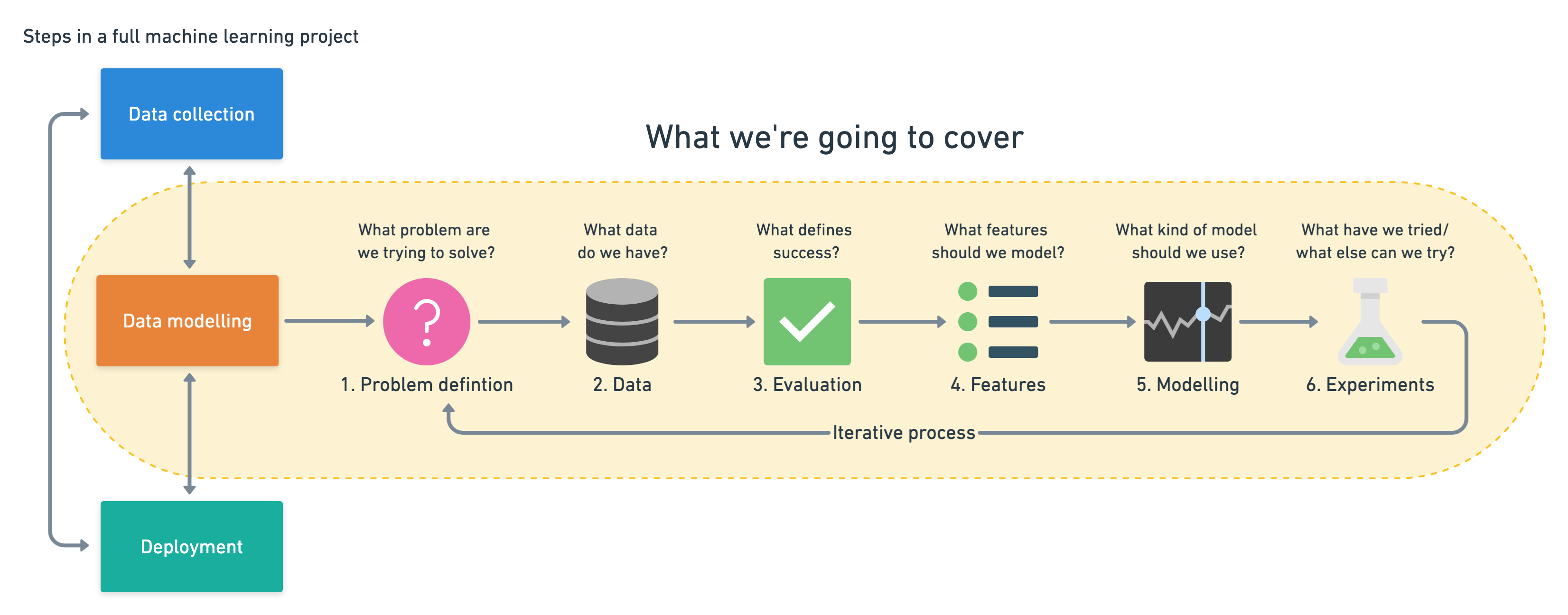 |
|---|
| 6 Step Machine Learning Modelling Framework |
More specifically, we'll look at the following topics.
- Exploratory data analysis (EDA) - the process of going through a dataset and finding out more about it.
- Model training - create model(s) to learn to predict a target variable based on other variables.
- Model evaluation - evaluating a models predictions using problem-specific evaluation metrics.
- Model comparison - comparing several different models to find the best one.
- Model fine-tuning - once we've found a good model, how can we improve it?
- Feature importance - since we're predicting the presence of heart disease, are there some things which are more important for prediction?
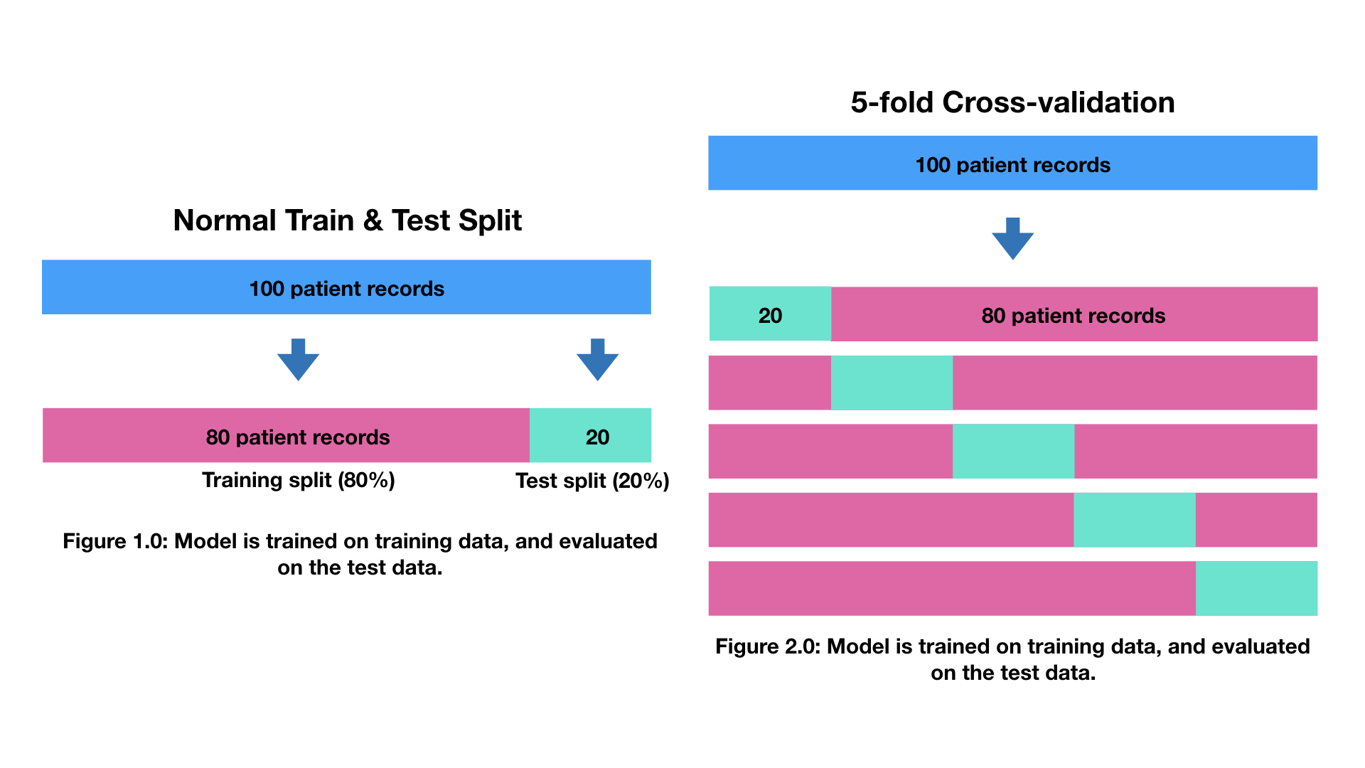
- Cross-validation - if we do build a good model, can we be sure it will work on unseen data?
- Reporting what we've found - if we had to present our work, what would we show someone?
To work through these topics, we'll use pandas, Matplotlib and NumPy for data anaylsis, as well as, Scikit-Learn for machine learning and modelling tasks.
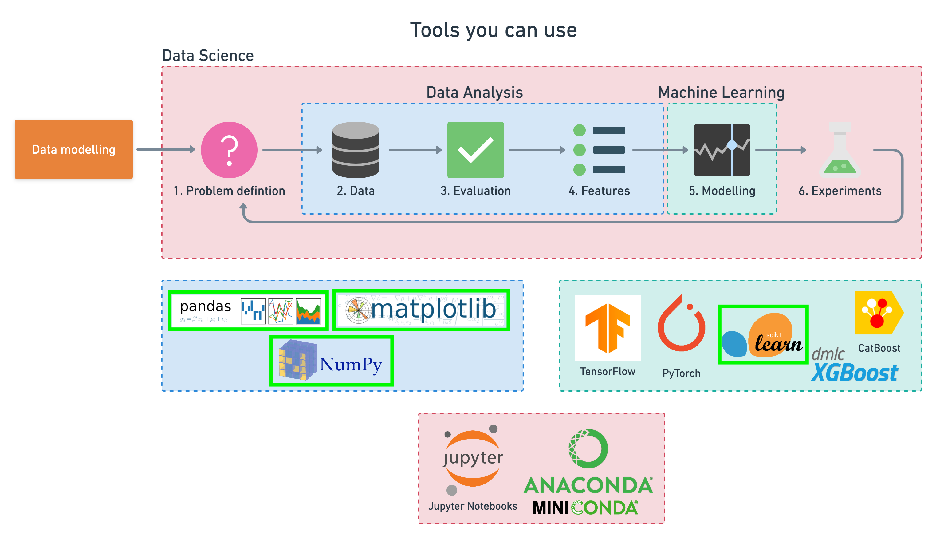 |
|---|
| Tools which can be used for each step of the machine learning modelling process. |
We'll work through each step and by the end of the notebook, we'll have a handful of models, all which can predict whether or not a person has heart disease based on a number of different parameters at a considerable accuracy.
You'll also be able to describe which parameters are more indicative than others, for example, sex may be more important than age.